Author: ryan

  • Case Study: Grimm Series Book Trailers

    Case Study: Grimm Series Book Trailers

    Grimm Series Book Trailers

    Bringing Dark Fairy Tales to Life Through Motion

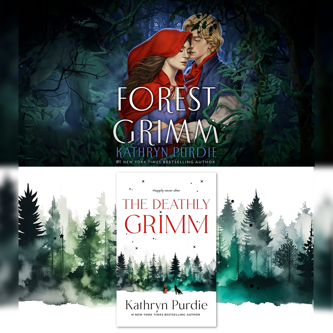
    When internationally published author Kathryn Purdie needed a way to generate excitement for The Forest Grimm and Deathly Grimm, she turned to Rybread Studio to create cinematic book trailers that would capture the atmosphere of the stories and encourage readers to dive into the series.

    As the sole creative on the project, I handled every aspect of production—from story development and illustration to animation, editing, sound design, and final delivery. The goal wasn’t simply to summarize the books, but to create an emotional experience that reflected the mystery, suspense, and folklore-inspired world of the Grimm series while staying visually consistent with the book cover art so readers would immediately recognize what the books would look like on store shelves.

    The Challenge

    Unlike a movie trailer, a book trailer has to spark a reader’s imagination without revealing too much of the story. Every visual, transition, sound, and element needed to build intrigue while leaving room for the audience to imagine the world for themselves.

    At the same time, the trailers needed to feel polished enough to compete with other promotional content across social media, author websites, and online retailers. Just as importantly, they had to remain consistent with the existing book cover art so the trailers would reinforce the brand and help readers connect the promotional visuals with the physical books they would see in stores and online.

    The Strategy

    I developed a visual style inspired by the existing art while keeping with the feel of dark fantasy and classic fairy tales, using layered illustrations, atmospheric lighting, cinematic typography, and motion graphics to create tension and curiosity.

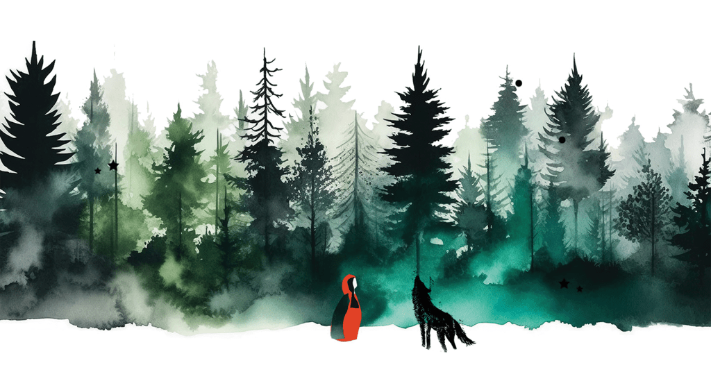
    To maintain consistency across the campaign, I used the book cover art as a visual foundation throughout the trailers. This helped ensure that the imagery, color palette, and overall tone aligned with the published covers, making it easier for readers to recognize the books and imagine how they would appear on store shelves.

    Each trailer was carefully paced to build momentum, allowing dramatic moments to breathe while highlighting key themes from the novels. Music, and subtle visual effects worked together to create an immersive viewing experience that reflected the tone of the books while keeping the cover art at the center of the brand presentation.

    Because I created every visual asset specifically for the trailers, the final pieces maintained a cohesive look from beginning to end while reinforcing the author’s existing brand and the recognizable identity established by the book covers.

    My Role

    As the creative lead on the project, I managed the entire production process from concept to final delivery. Working closely with the author, I identified the themes, tone, and emotional beats that would resonate with readers while avoiding major plot spoilers.

    I translated those ideas into storyboards , custom illustrations, and some A.I. image generation, carefully composing each scene to capture the mystery and atmosphere of the Grimm universe. Every visual element was designed to complement the existing cover artwork, ensuring the trailers felt like a natural extension of the books’ visual identity rather than a separate marketing piece.

    Once the creative direction was established, I brought the artwork to life through animation, cinematic typography, compelling transitions, and visual effects. I also edited the trailers, selected and synchronized music, and refined the pacing to build suspense and maintain viewer engagement from beginning to end.

    By overseeing every stage of production, I delivered a cohesive promotional campaign that balanced storytelling, illustration, motion design, and brand consistency while giving the author versatile marketing assets for online and social media promotion.

    The Outcome

    The completed trailers gave the author polished promotional pieces that could be shared across websites, social media, book launches, and marketing campaigns. More importantly, they transformed static book marketing into an engaging visual experience that invited potential readers into the world before they ever opened the first page, while also reinforcing the familiar look of the book cover art so the series would feel instantly recognizable on store shelves.

    The project demonstrates how motion design can extend a brand beyond traditional print materials, helping stories connect with audiences in a memorable and emotionally engaging way while keeping the visual identity consistent across every touchpoint.

  • Case Study: Parkway Pedal

    Case Study: Parkway Pedal

    Parkway Pedal

    Building a cohesive event brand for a charity cycling experience

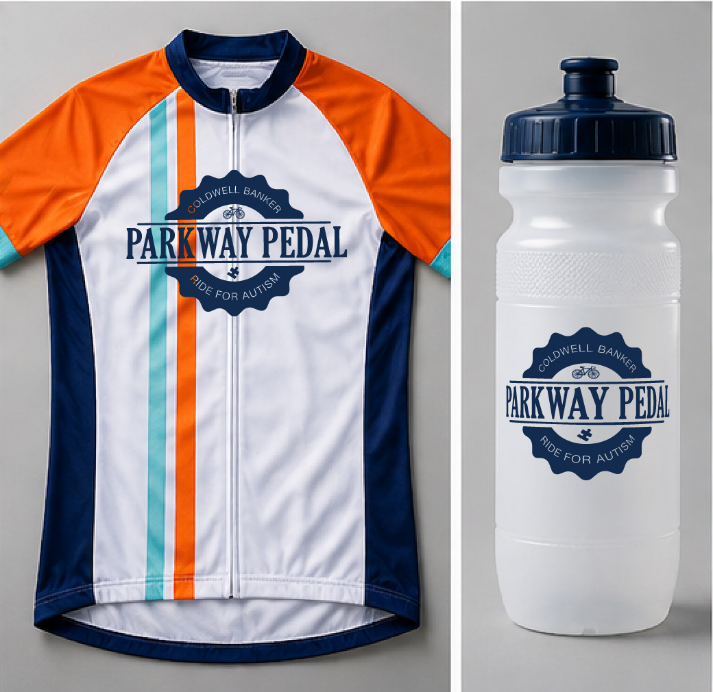
    Parkway Pedal was a charity cycling event sponsored by Coldwell Banker to bring the community together around fitness, fundraising, and local engagement. I was brought in to develop a complete visual identity that could promote the event across multiple touchpoints and create excitement before race day.

    The goal was to build a recognizable, energetic brand that appealed to cyclists, families, and sponsors alike while clearly communicating the event’s purpose and value.

    The Challenge

    The event needed more than a logo—it needed a full campaign identity that could scale across print, digital, and environmental media.

    The core challenges included:

    • Creating a brand that felt active, fun, and community-focused
    • Designing visuals that could attract participants and sponsors
    • Maintaining consistency across many promotional materials
    • Helping the event stand out in a crowded local event landscape

    Because this was a charity event, the branding also needed to feel approachable and inclusive rather than overly competitive or “elite cyclist.”proachable and fun for young readers.

    My Role

    As the lead designer, I developed the entire visual identity and supporting campaign materials from concept through final production.

    My responsibilities included:

    • Logo design
    • Brand identity development
    • Direct mail pieces
    • Email blast
    • Promotional collateral and marketing assets
    • Billboard design

    I owned both the creative direction and execution, ensuring every touchpoint felt cohesive and aligned with the event’s goals.

    The Strategy

    I approached the project by focusing on three brand pillars:

    1. Energy

    The visuals needed to capture motion, speed, and excitement to reflect the cycling experience.

    2. Community

    This event was about bringing people together for a good cause, so the branding needed warmth and accessibility.

    3. Visibility

    Promotional materials had to communicate quickly and effectively, whether seen on a billboard, mailer, or website.

    To support these goals, I used bold typography, dynamic composition, and a vibrant color palette that created momentum and visual impact.

    The Solution

    The final brand system delivered a strong, recognizable identity that worked across every medium.

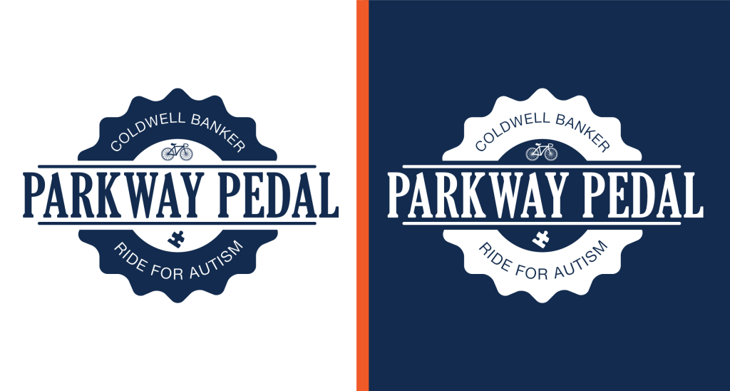
    The logo combined clean, modern design with visual cues inspired by cycling and movement. Supporting graphics reinforced the feeling of forward motion and helped unify the campaign.

    From large-format billboards to direct mail and web assets, every piece worked together to create a seamless brand experience. The consistent identity helped establish trust, improve recognition, and generate enthusiasm around the event.

    The result was a polished event brand that elevated Parkway Pedal from a simple community ride into a professional, memorable experience that sponsors and participants could rally behind.

  • Case Study: Little Saigon

    Case Study: Little Saigon

    Case Study: Little Saigon

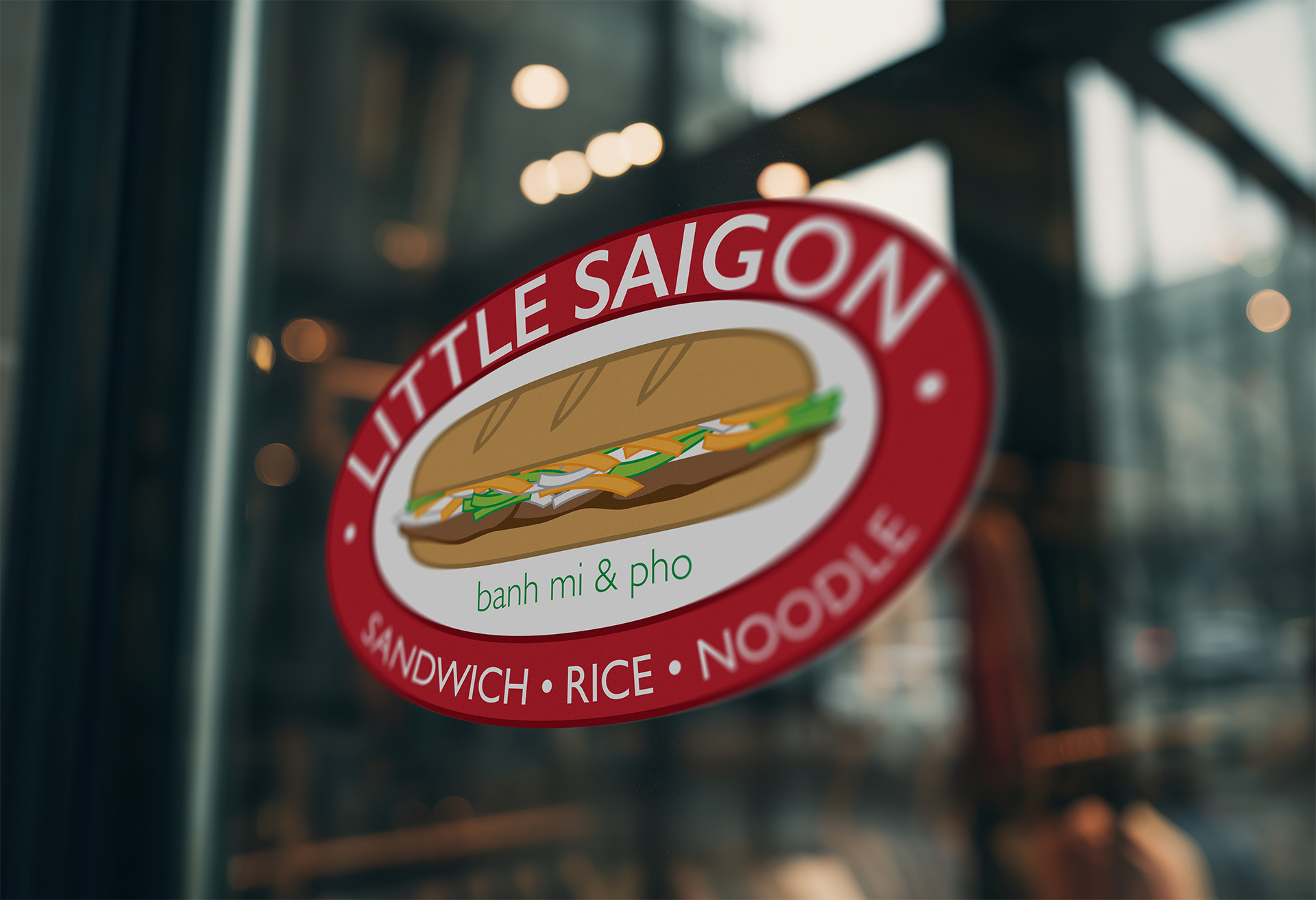
    Little Saigon Restaurant Brand System

    Little Saigon is a Vietnamese restaurant built around fresh ingredients, bold flavors, and a welcoming dining experience. As a brand-new business entering a competitive food market, they needed a cohesive identity that would help them stand out and build trust from day one.

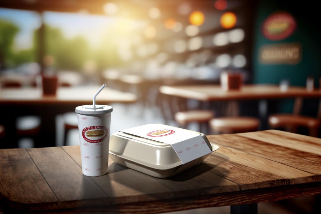
    I developed the complete brand system as the sole designer on the project, creating everything needed for launch—including the logo, menus, uniforms, packaging, and business cards.

    The Challenge

    The biggest challenge was speed without sacrificing quality. The restaurant was moving quickly toward opening day, which meant the brand needed to be designed, refined, and production-ready on a tight timeline.

    The identity also needed to be highly versatile. It had to look polished on large-format signage, readable on small business cards, recognizable on takeout packaging, and flexible enough for both print and digital applications.

    Most importantly, the branding needed to capture the personality of the restaurant: warm, modern, and rooted in Vietnamese culture without relying on clichés.

    My Role

    As the sole designer, I handled the project from concept to final production.

    My responsibilities included:

    • Brand strategy and visual direction
    • Logo design and refinement
    • Typography and color system selection
    • Menu design and layout
    • Uniform graphicsPackaging design
    • Business card design
    • Production-ready file preparation for print and digital use

    The Strategy

    I focused on building a brand system that balanced simplicity with personality. The visual identity needed to feel clean and contemporary while still reflecting the warmth and energy of the restaurant experience.

    The logo was designed with versatility as a top priority. It needed to remain clear and recognizable whether used on storefront signage, embroidered apparel, social media, printed menus, or food packaging.

    A consistent typography and color system helped unify every brand touchpoint, creating a professional and memorable experience for customers.

    The Solution

    The final brand system gave Little Saigon a strong visual foundation for launch and future growth. Every asset—from menus to packaging—worked together as part of one cohesive identity, helping the restaurant present itself as polished and established from day one.

    The flexible brand system also scaled with the business as it expanded. What began as branding for a single restaurant became the visual foundation for a growing company with multiple locations across Utah.

    By designing a thoughtful, adaptable system rather than isolated assets, the brand was built to support both immediate launch needs and long-term success.

  • Case Study: Potato Family Christmas

    Case Study: Potato Family Christmas

    Potato Family Christmas

    Bringing a whimsical holiday story to life through character design and illustration.

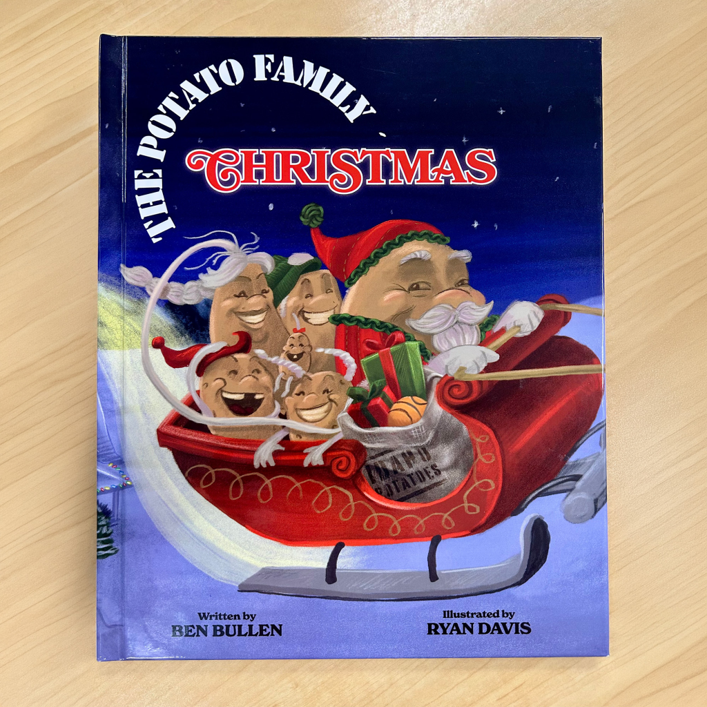
    When an author approached Rybread Studio with a completed manuscript for Potato Family Christmas, the goal was clear: transform a written story into a warm, engaging picture book that children and families would enjoy during the holiday season.

    The challenge was to create a cast of memorable characters and illustrations that felt playful, expressive, and emotionally inviting—while staying true to the heart of the story.

    The Challenge

    The manuscript already had charm and personality, but words alone weren’t enough to carry the full emotional experience of a children’s book. The visuals needed to:

    • Give each potato family member a unique personality
    • Create scenes full of warmth, humor, and holiday magic
    • Maintain visual consistency across every spread
    • Be prepared for professional print production

    The artwork needed to feel polished enough for publication while remaining approachable and fun for young readers.

    My Role

    Rybread Studio handled the visual development and production of the book, including:

    • Character Design
    • Illustration
    • Page Layout & Composition
    • Print File Preparation

    The Process

    The project began with character exploration of a potato version of Santa Claus. In this example, I developed visual concepts Saint Root, focusing on a jolly silhouette, a kind facial expression, and small design details that helped this character feel distinct and recognizable.

    I pitched the first character sketch of a potato version of the classic Santa design. The author then noted that Saint Root, was not Santa and needed to feel distinctly different, and needed arms. I redesigned the beard, costume, colors, and other details to match what the author imagined.

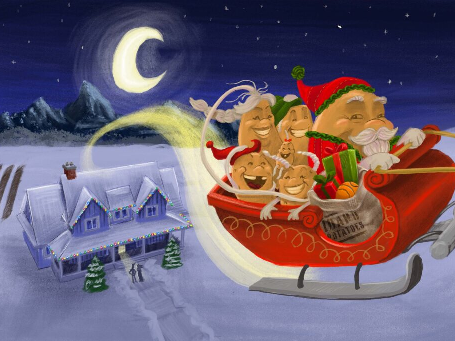
    Once the character designs were approved, I moved into full-scene illustration. This page was carefully composed to support the story’s pacing and emotional beats, using color, lighting, and staging to set the tone for the entire book.

    The Solution

    The final book combined expressive character illustration with cozy holiday visuals to create a storybook experience that felt charming and memorable.

    The potato family became more than simple characters—they became personalities readers could connect with.

    By pairing thoughtful visual storytelling with production-ready design, the project successfully moved from manuscript to printed book.

    Outcome

    Potato Family Christmas became a fully illustrated, print-ready children’s book that brought the author’s vision to life.

    This project highlights how strong illustration and thoughtful design can elevate a written story into an immersive visual experience—turning simple words on a page into something readers can truly feel.

    You can find this book for sale online, and the Potato Museum in Idaho.