Category: Brand Design

  • Case Study: Parkway Pedal

    Case Study: Parkway Pedal

    Parkway Pedal

    Building a cohesive event brand for a charity cycling experience

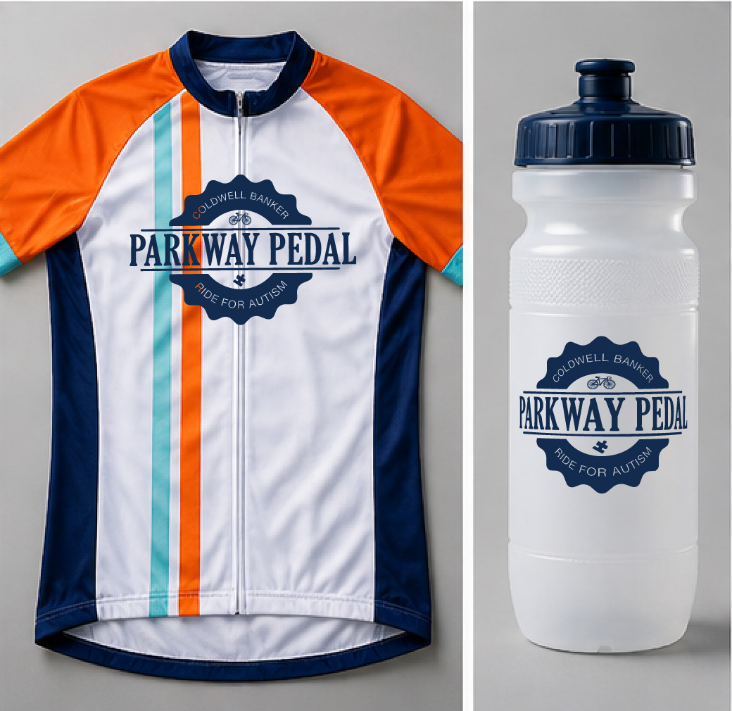
    Parkway Pedal was a charity cycling event sponsored by Coldwell Banker to bring the community together around fitness, fundraising, and local engagement. I was brought in to develop a complete visual identity that could promote the event across multiple touchpoints and create excitement before race day.

    The goal was to build a recognizable, energetic brand that appealed to cyclists, families, and sponsors alike while clearly communicating the event’s purpose and value.

    The Challenge

    The event needed more than a logo—it needed a full campaign identity that could scale across print, digital, and environmental media.

    The core challenges included:

    • Creating a brand that felt active, fun, and community-focused
    • Designing visuals that could attract participants and sponsors
    • Maintaining consistency across many promotional materials
    • Helping the event stand out in a crowded local event landscape

    Because this was a charity event, the branding also needed to feel approachable and inclusive rather than overly competitive or “elite cyclist.”proachable and fun for young readers.

    My Role

    As the lead designer, I developed the entire visual identity and supporting campaign materials from concept through final production.

    My responsibilities included:

    • Logo design
    • Brand identity development
    • Direct mail pieces
    • Email blast
    • Promotional collateral and marketing assets
    • Billboard design

    I owned both the creative direction and execution, ensuring every touchpoint felt cohesive and aligned with the event’s goals.

    The Strategy

    I approached the project by focusing on three brand pillars:

    1. Energy

    The visuals needed to capture motion, speed, and excitement to reflect the cycling experience.

    2. Community

    This event was about bringing people together for a good cause, so the branding needed warmth and accessibility.

    3. Visibility

    Promotional materials had to communicate quickly and effectively, whether seen on a billboard, mailer, or website.

    To support these goals, I used bold typography, dynamic composition, and a vibrant color palette that created momentum and visual impact.

    The Solution

    The final brand system delivered a strong, recognizable identity that worked across every medium.

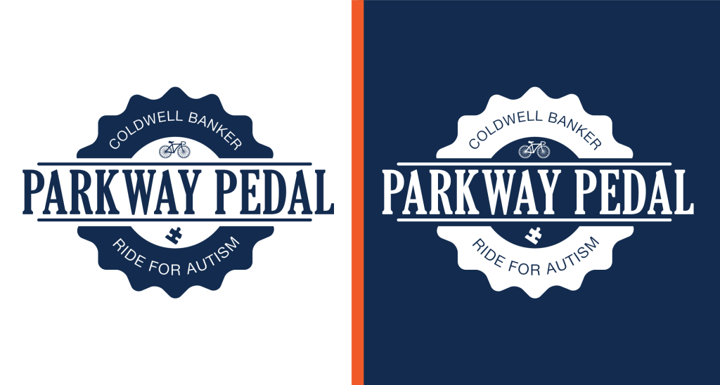
    The logo combined clean, modern design with visual cues inspired by cycling and movement. Supporting graphics reinforced the feeling of forward motion and helped unify the campaign.

    From large-format billboards to direct mail and web assets, every piece worked together to create a seamless brand experience. The consistent identity helped establish trust, improve recognition, and generate enthusiasm around the event.

    The result was a polished event brand that elevated Parkway Pedal from a simple community ride into a professional, memorable experience that sponsors and participants could rally behind.

  • Case Study: Little Saigon

    Case Study: Little Saigon

    Case Study: Little Saigon

    Little Saigon Restaurant Brand System

    Little Saigon is a Vietnamese restaurant built around fresh ingredients, bold flavors, and a welcoming dining experience. As a brand-new business entering a competitive food market, they needed a cohesive identity that would help them stand out and build trust from day one.

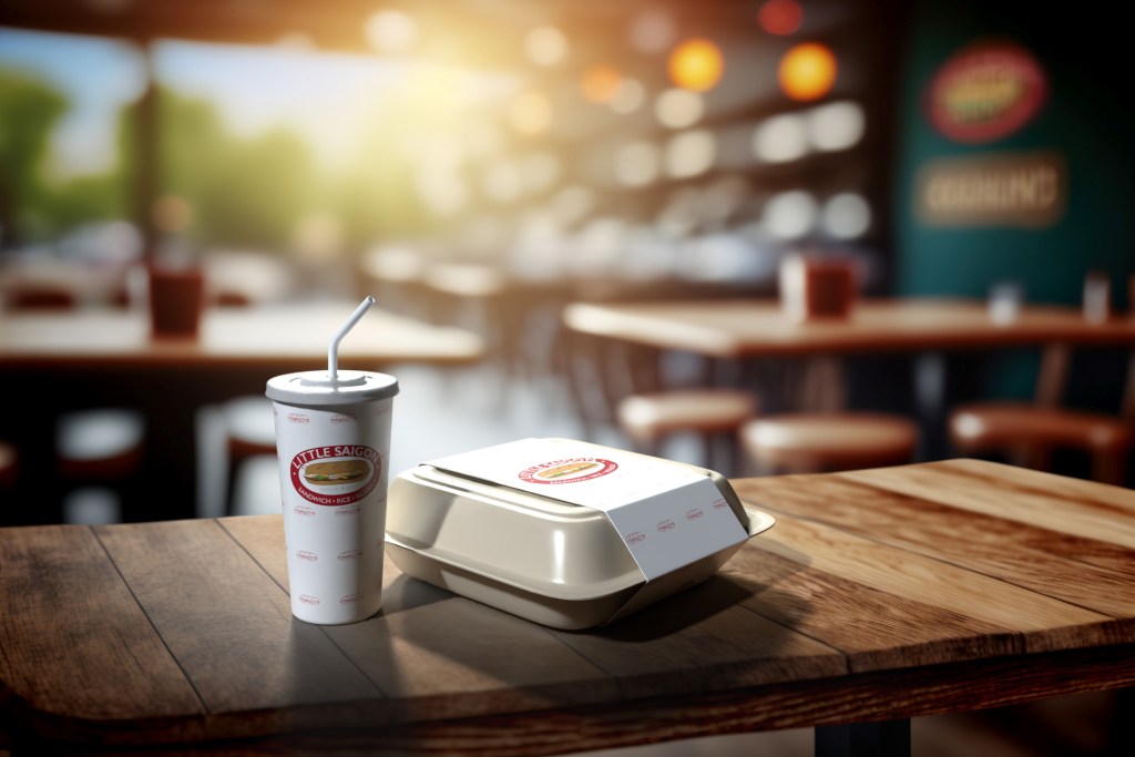
    I developed the complete brand system as the sole designer on the project, creating everything needed for launch—including the logo, menus, uniforms, packaging, and business cards.

    The Challenge

    The biggest challenge was speed without sacrificing quality. The restaurant was moving quickly toward opening day, which meant the brand needed to be designed, refined, and production-ready on a tight timeline.

    The identity also needed to be highly versatile. It had to look polished on large-format signage, readable on small business cards, recognizable on takeout packaging, and flexible enough for both print and digital applications.

    Most importantly, the branding needed to capture the personality of the restaurant: warm, modern, and rooted in Vietnamese culture without relying on clichés.

    My Role

    As the sole designer, I handled the project from concept to final production.

    My responsibilities included:

    • Brand strategy and visual direction
    • Logo design and refinement
    • Typography and color system selection
    • Menu design and layout
    • Uniform graphicsPackaging design
    • Business card design
    • Production-ready file preparation for print and digital use

    The Strategy

    I focused on building a brand system that balanced simplicity with personality. The visual identity needed to feel clean and contemporary while still reflecting the warmth and energy of the restaurant experience.

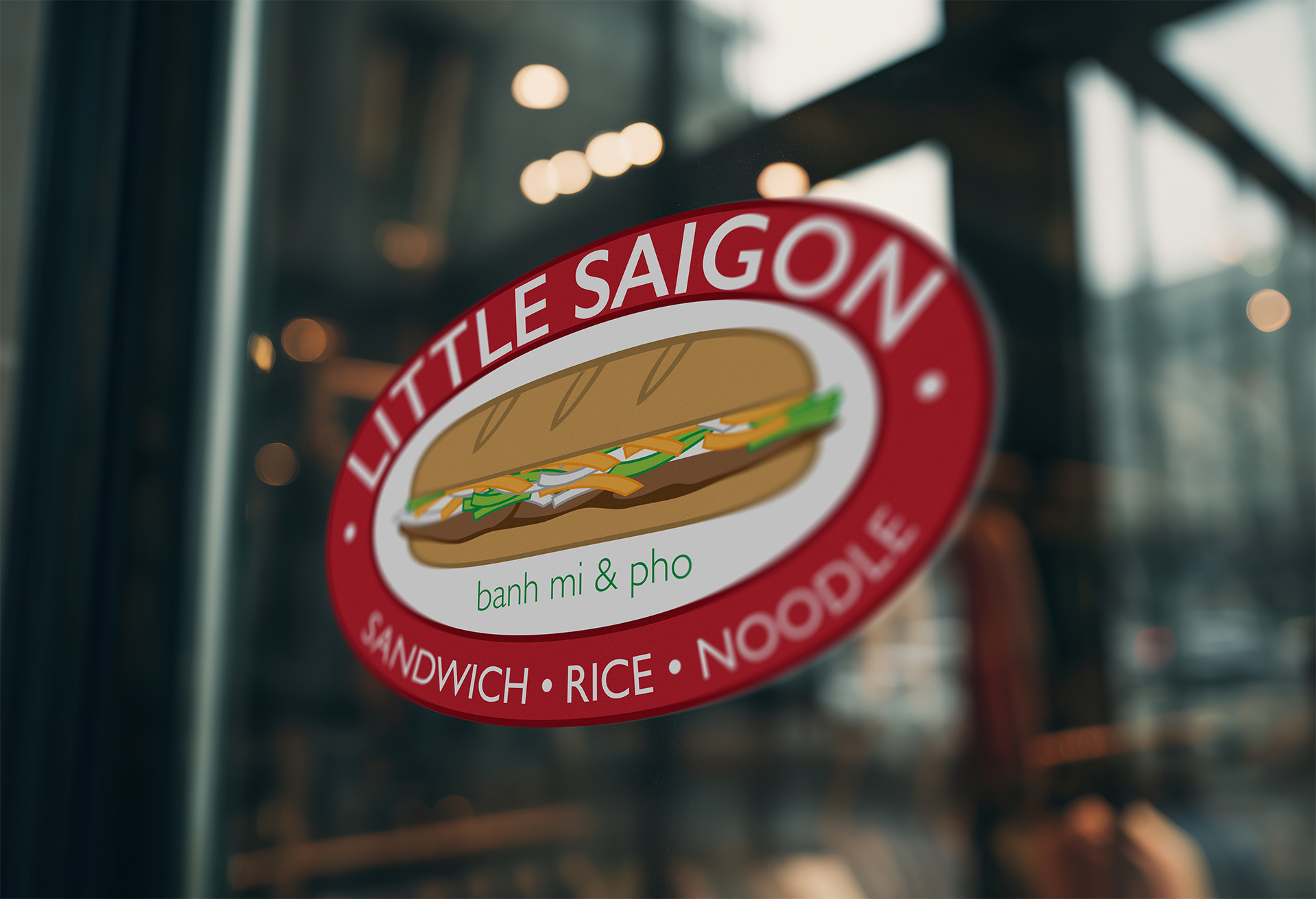
    The logo was designed with versatility as a top priority. It needed to remain clear and recognizable whether used on storefront signage, embroidered apparel, social media, printed menus, or food packaging.

    A consistent typography and color system helped unify every brand touchpoint, creating a professional and memorable experience for customers.

    The Solution

    The final brand system gave Little Saigon a strong visual foundation for launch and future growth. Every asset—from menus to packaging—worked together as part of one cohesive identity, helping the restaurant present itself as polished and established from day one.

    The flexible brand system also scaled with the business as it expanded. What began as branding for a single restaurant became the visual foundation for a growing company with multiple locations across Utah.

    By designing a thoughtful, adaptable system rather than isolated assets, the brand was built to support both immediate launch needs and long-term success.