Silk and Sensibility Book Trailer
A 16th-Century Chinese Romance Set to Motion
For a local mid-sized publisher, I created a cinematic book trailer for Silk and Sensibility, a historical romance set in 16th-century Ming Dynasty China. Working across 30- and 60-second versions in both horizontal and vertical formats, I led the project from initial concept and art direction through design, animation, compositing, and final editing.


The Challenge
How do you capture the emotional tension, elegance, and romantic intrigue of a novel set in 16th-century Ming Dynasty China in less than a minute?
For Silk and Sensibility, I was asked to create a promotional book trailer that would introduce potential readers to the world of the novel while establishing its atmosphere, setting, and emotional tension. The piece needed to feel romantic and cinematic while remaining grounded in the visual language of Ming Dynasty China.
The trailer also needed to work across multiple formats, including traditional horizontal video and vertical social media placements.
The Concept
I began by identifying the emotional qualities at the heart of the story: romance, restraint, longing, elegance, and tension.
Rather than attempting to visually recreate the entire story, I approached the trailer as a short cinematic mood piece. The goal was to create the feeling of the novel and invite the viewer into its world.
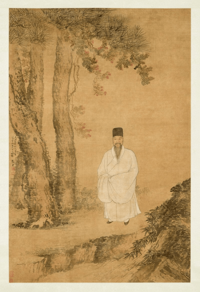
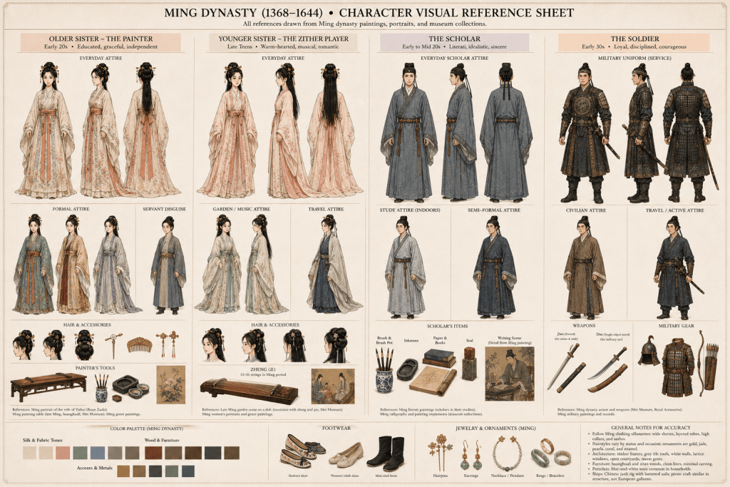
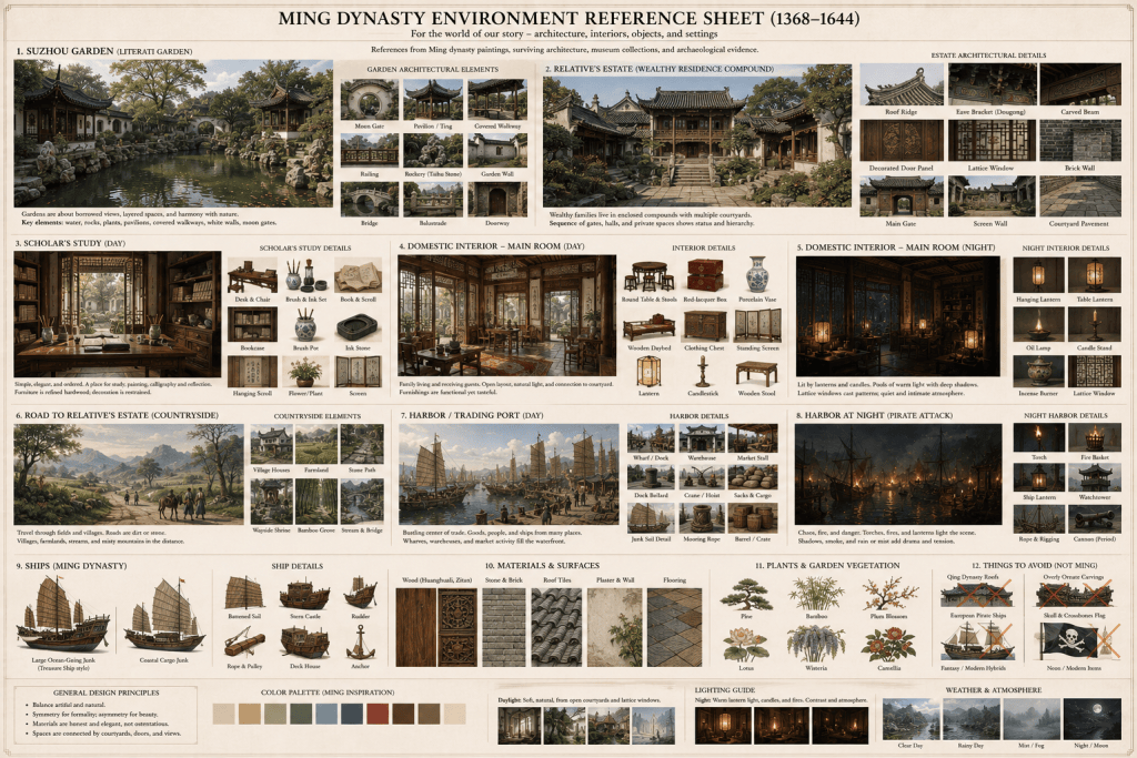
The visual direction drew from the architecture, clothing, landscapes, decorative arts, and cultural atmosphere of Ming Dynasty China, while focusing on intimate details that could communicate the story quickly.
AI tools were used selectively during the early research and conceptualization phase to explore historical visual references and possible approaches to imagery, composition, and atmosphere. The final visual direction, design, animation, compositing, and editing were developed and executed for the finished piece.


Developing the Visual Language
One of the central challenges was creating a visual world that felt connected to 16th-century China without turning the trailer into a collection of generic historical imagery.
I focused on visual details that could establish the setting while supporting the romantic story:
- Ming Dynasty clothing and silhouettes
- Traditional Chinese architecture and interiors
- Silk, textiles, and decorative details
- Handwritten correspondence and calligraphic elements
- Landscapes and natural environments
- Intimate character moments
- Rich, atmospheric compositions
- Cinematic lighting and movement
The visual language was designed to feel elegant and immersive while leaving room for the viewer’s imagination.
From Concept to Storyboard
Once the visual direction was established, I began constructing the trailer around a series of emotional beats rather than simply matching images to narration.
The opening establishes the main characters, world, and historical setting.
From there, the pacing becomes increasingly intimate, introducing the romantic tension at the heart of the story. Visual transitions connect individual moments while allowing the narrative to build toward its emotional climax.
Typography was treated as part of the storytelling rather than simply an informational layer. Titles, excerpts, and promotional copy were timed carefully with the imagery and music so the trailer could maintain a cinematic rhythm.


Storyboard Animatic
Layered Scene

Animated Bird Sequence

Motion Design & Animation
The imagery was brought to life through compositing, camera movement, transitions, typography, and subtle environmental animation.
Rather than relying on constant movement, I used motion strategically. Slow camera pushes, layered depth, controlled transitions, and atmospheric details helped create the sensation of moving through a historical world.
The goal was to make the imagery feel alive while maintaining the elegance and restraint appropriate to the subject.
Music played an important role in establishing the emotional tone. The trailer uses Mo Li Hua to create a musical connection to Chinese culture while providing an emotional structure for the edit.
Designing for Multiple Formats
The project was developed for both horizontal and vertical viewing.
Rather than simply cropping a finished horizontal composition, I considered aspect ratio and focal points throughout the design process. Important visual elements, typography, and transitions were constructed so they could remain effective across different screen sizes.
This allowed the final piece to function as both a traditional promotional video and a social-first piece of content.
As you can see, I adjusted the composition between the horizontal and vertical versions. This allowed support to the important elements of the scene.


The Finished Piece
The final result is a cinematic promotional trailer designed to introduce viewers to the world of Silk and Sensibility before they ever open the book.
Instead of attempting to explain the entire story, the trailer focuses on atmosphere, romance, character, and unanswered questions. The result is intended to work both as a piece of motion design and as a piece of book marketing: visually compelling enough to capture attention while creating curiosity about the story.
30 Second
60 Second
Deliverables
60-second trailer
Full-length cinematic version designed to establish the story, setting, atmosphere, and emotional arc.
30-second trailer
Condensed version focused on the strongest narrative and promotional beats.
Horizontal format
Designed for websites, YouTube, and traditional video placements.
Vertical format
Optimized for social media and mobile viewing.
The Takeaway
Silk and Sensibility brought together graphic design, illustration, motion, editing, historical research, and storytelling in a single promotional piece.
The project was an opportunity to build a visual world from the ground up and use motion to transform individual images and design elements into something with pacing, emotion, and narrative.
For a book trailer, the goal isn’t simply to show the book.
It’s to make someone want to step inside it.